top of page
2026
THE KAPDA PROJECT
(BRAND IDENTITY) (OVERALL VISUAL STRATEGY)
(CREATIVE DIRECTION) (IMPACT DRIVEN DESIGN)
A branding and identity project for The Kapda Project, building a distinctive visual language for an upcycled fashion label championing circular design, textile reuse, and sustainable craftsmanship.
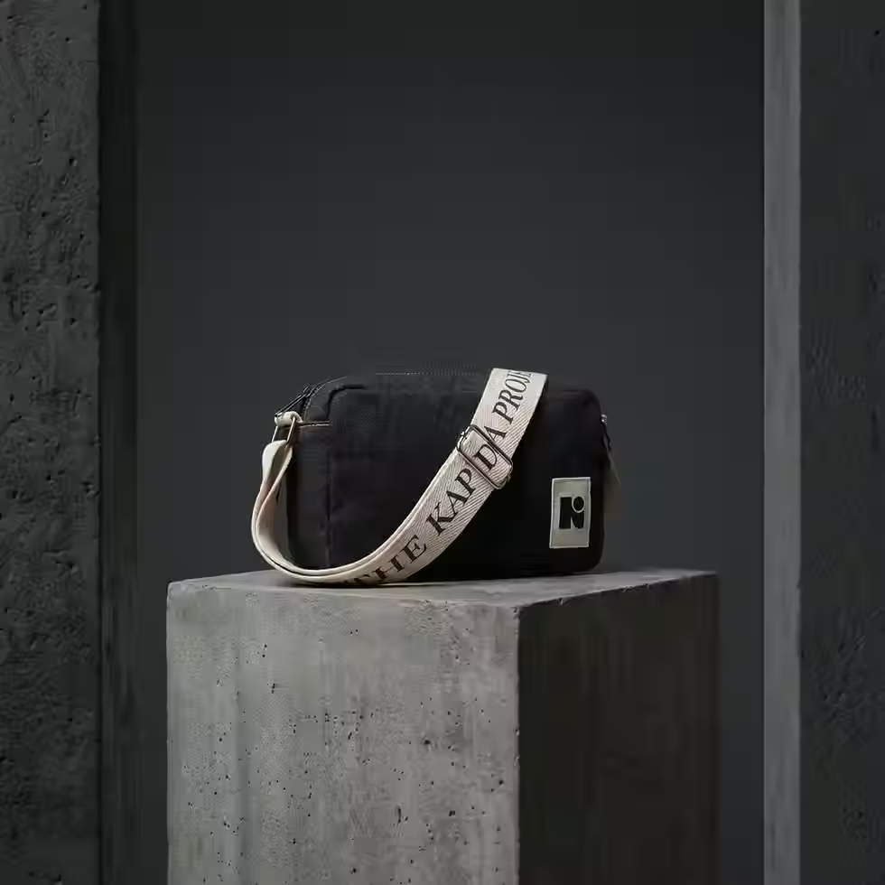

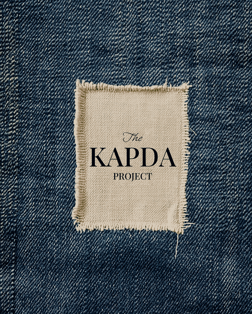



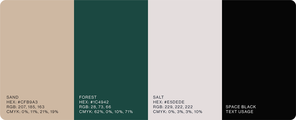

The Kapda Project is an upcycling initiative that transforms textile waste into contemporary fashion and everyday objects. The identity was built around the idea that sustainability should feel desirable rather than instructional, creating a visual language that balances environmental impact with cultural relevance and modern aesthetics.
Drawing inspiration from product labels, manufacturing marks, and everyday packaging, the system turns impact data into a core storytelling device. Modular layouts, bold typography, and graphic information panels communicate the value of each piece
highlighting material savings, local production, and circular design principles in a way that feels accessible, transparent, and engaging.


bottom of page